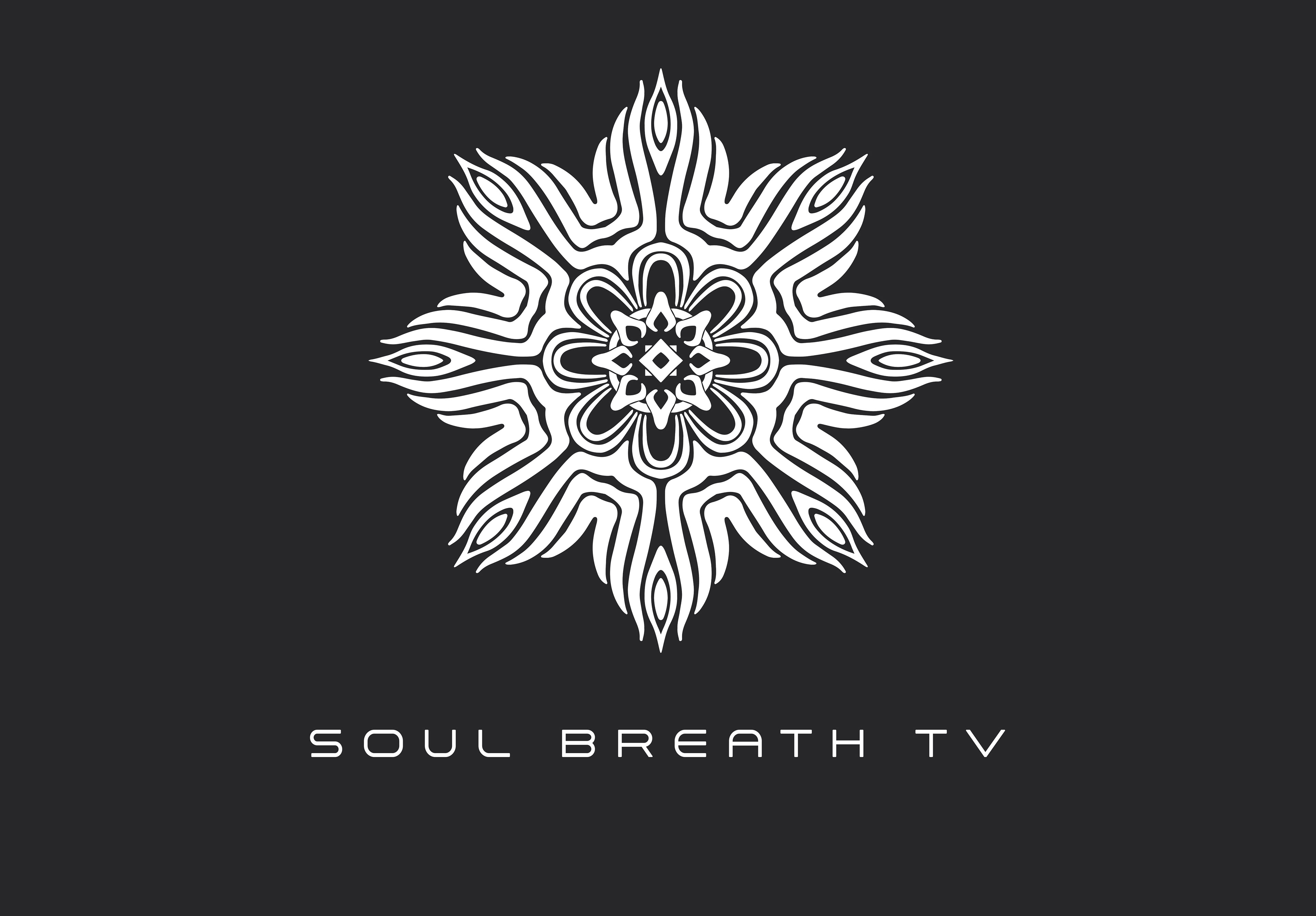
A few months ago I worked with a client who had a vision from his week long ayahuasca journey in Peru. Not going into detail about his personal vision he had but it opened up the doorway into his new project called Soul Breath TV.
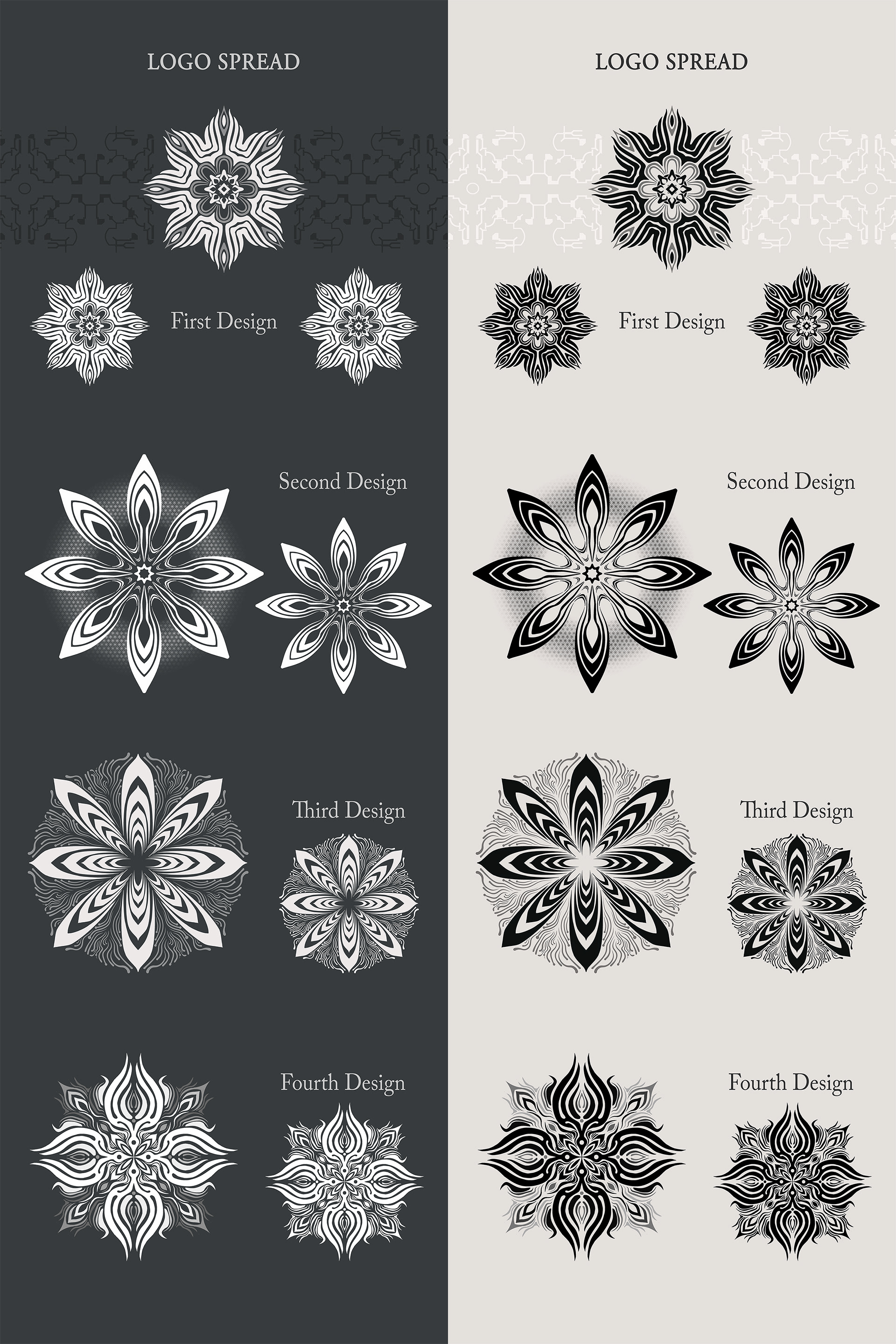
The first image in the grid above is the logo spread sheet I do with 4 options. This is more time consuming part before I hand the spread sheet to the client to choose. He went with the first one in the spread. The next image is a mini spread with his revisions to see how it looked with and without parts to the logo and he was thinking about a flower of life behind it but we steered clear of that to keep it simple.
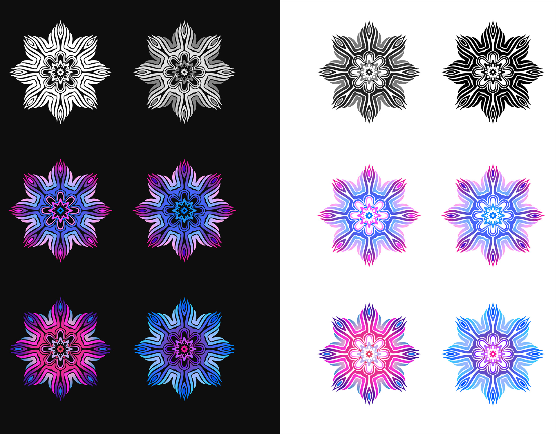
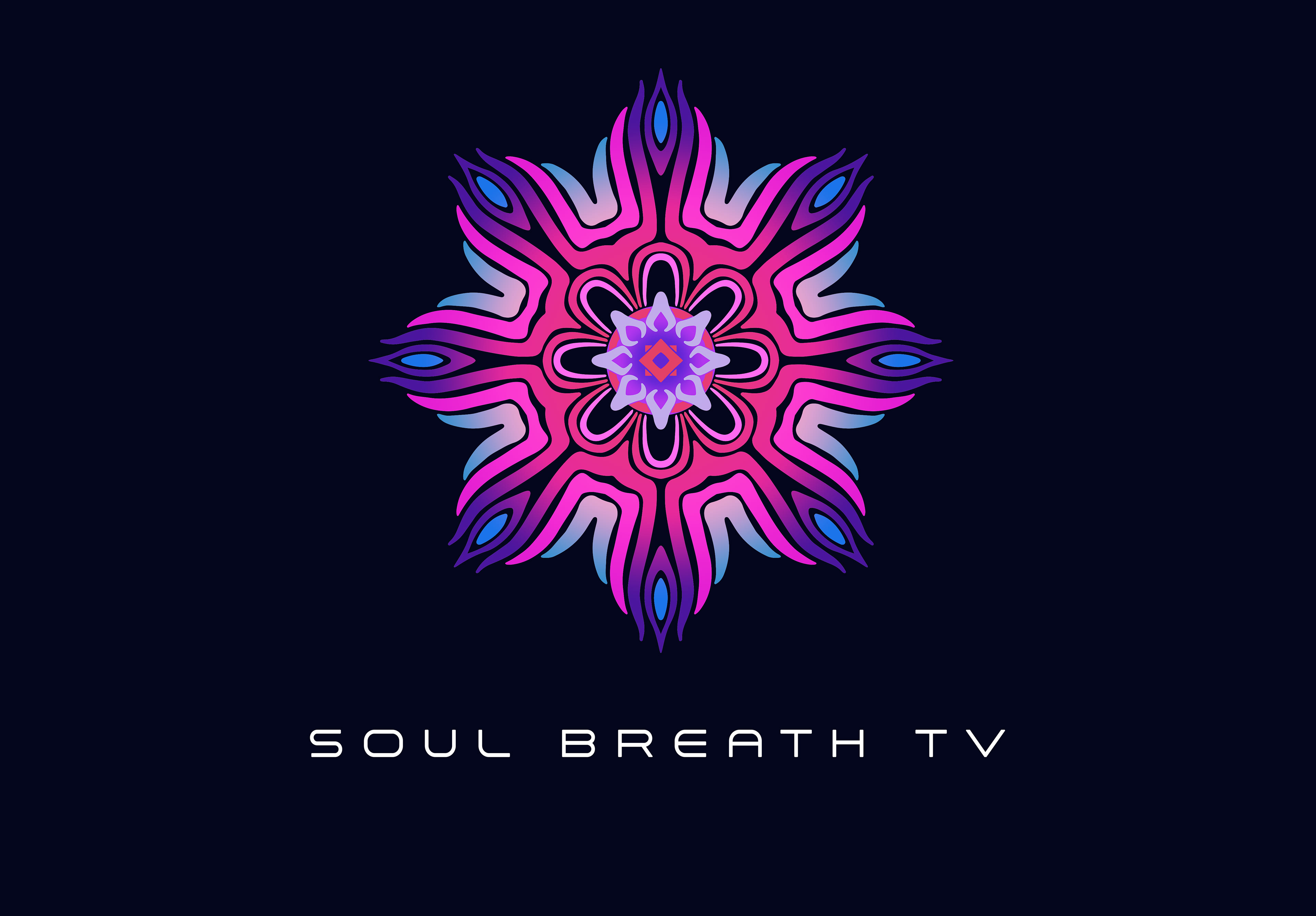
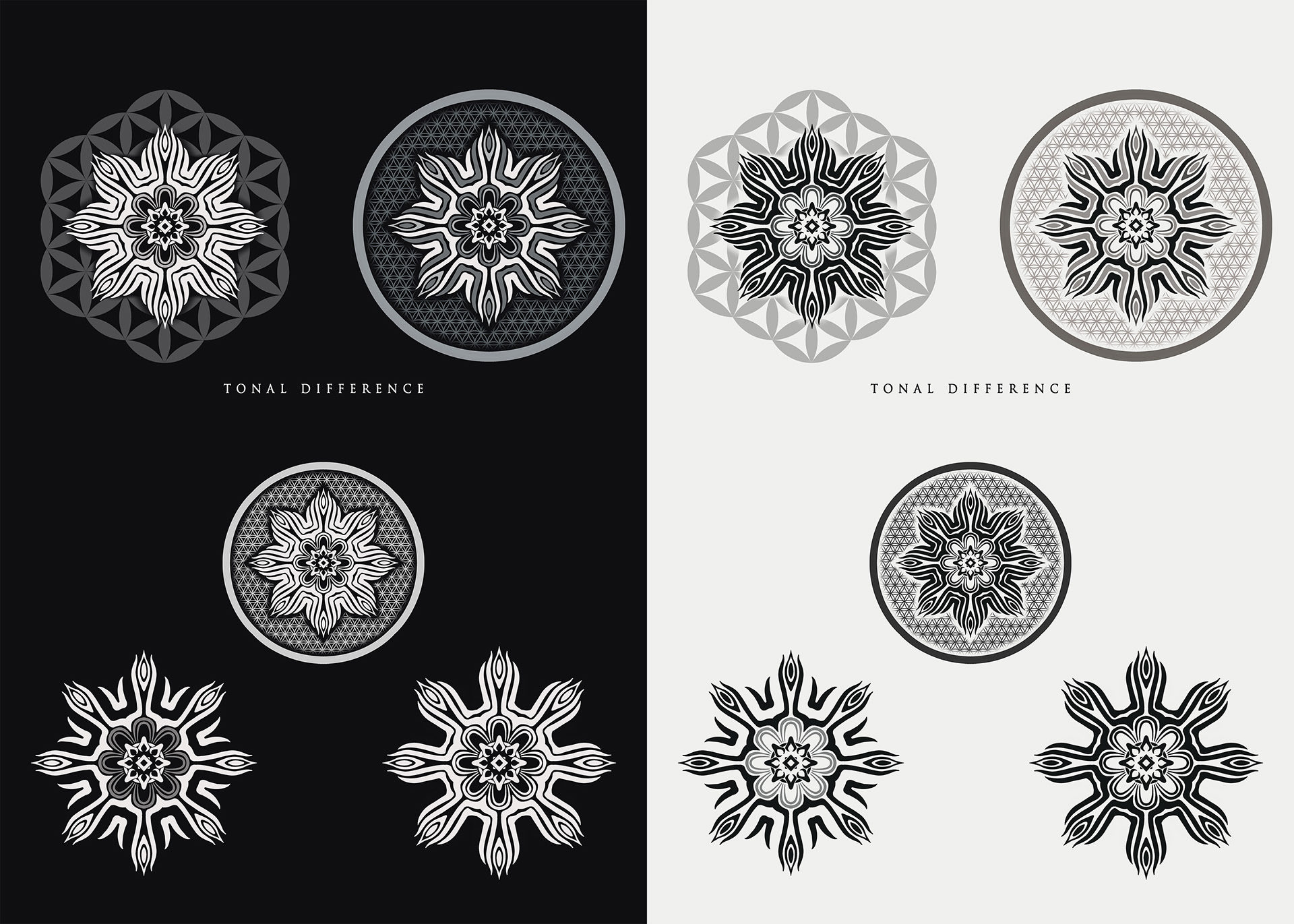
The color spread in the first image had some tonal variation with his brand colors. He choose the first 3 colored ones of the logo and his absolute favorite was the neon pink one with subtle blue. The client choose this font even though it was not apart of the logo package agreement to be added. He was a very pleasant client. I like the journey of envisioning a logo for clients and the act of meeting my minds eye to theirs.